

tricks to make web apps feel native

tricks to make web apps feel native
open-source, web, tauri
For a few months I’ve been working on a music player for OpenSubsonic servers (Navidrome, Gonic, etc) called tinysub. Rather than a Qt or SwiftUI app, I went with a web app so that this could run on any device easily.
One of the biggest things I focused on while developing this app was performance, which Svelte and Vite mostly solved for me. But another thing I focused on was making it look and feel like a native application, atleast on MacOS.1 So I wanted to write down some notes about my experience, in case it might help someone in the future.
Here’s examples of how it turned out:
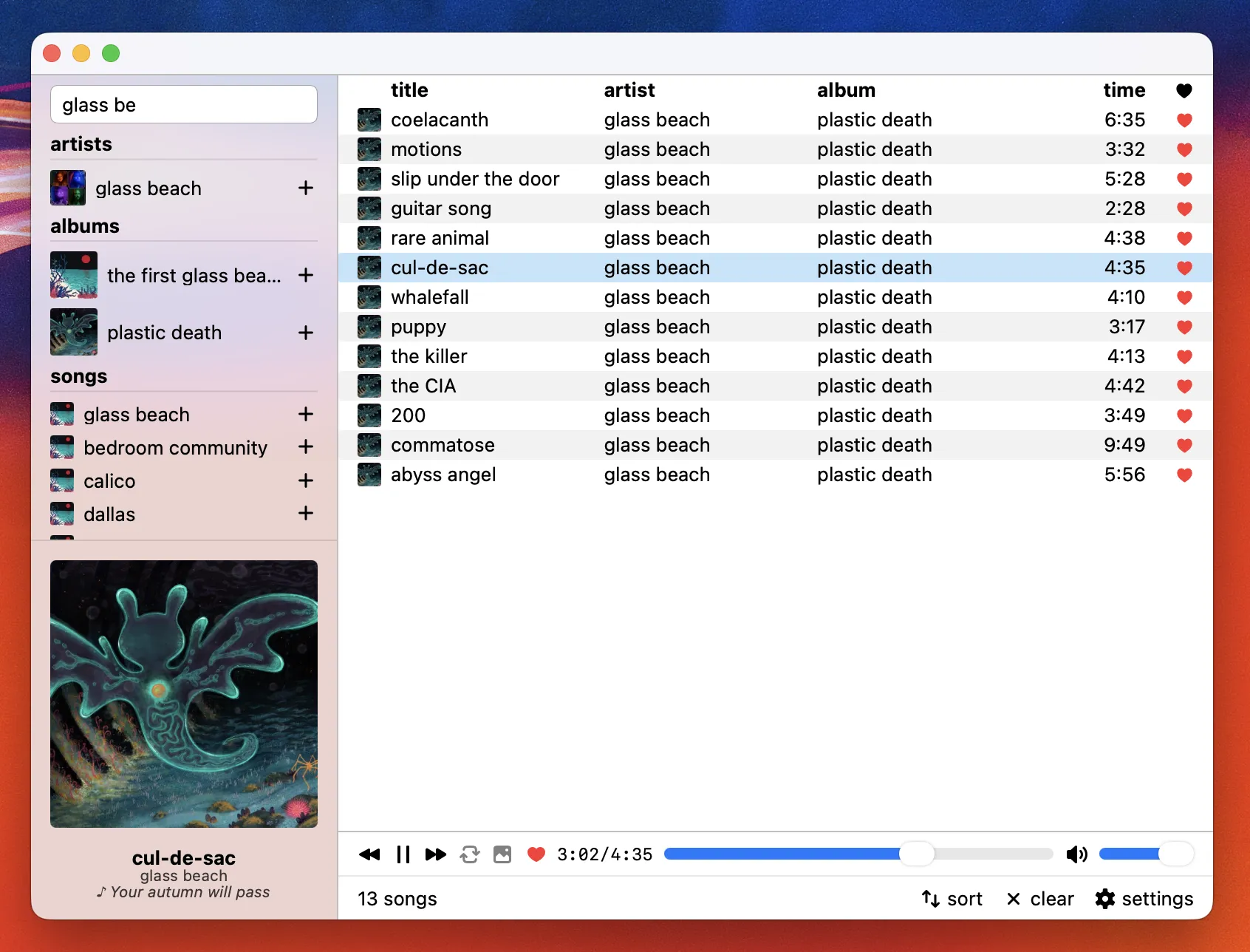
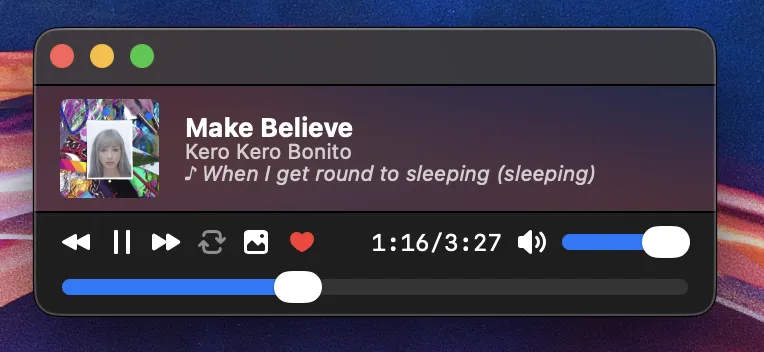
I’m using Tauri to build tinysub, however I’m sure you could probably achieve all the same things with Electron.
tricks
1. use system font size and family
On MacOS (seemingly Windows too), most native applications typically use 13px (0.8125rem) font size by default for most elements. Browsers typically use 16px (1rem) font size by default. Changing the default font size can make a huge difference in how your application looks and feels compared to native, and having a smaller font size also lets you fit much more on the screen!
html { font-size: 0.8125rem;}Unless you are choosing a specific font for your brand, I recommend using the system font (San Francisco on MacOS, Segoe UI on Windows). Not only does this make your app bundle lighter, since you’re not bundling any fonts, it also looks more consistent with the rest of the operating system. This is what I typically use, leaving sans-serif as a fallback for compatibility:
html { font-family: ui-sans-serif, system-ui, sans-serif;}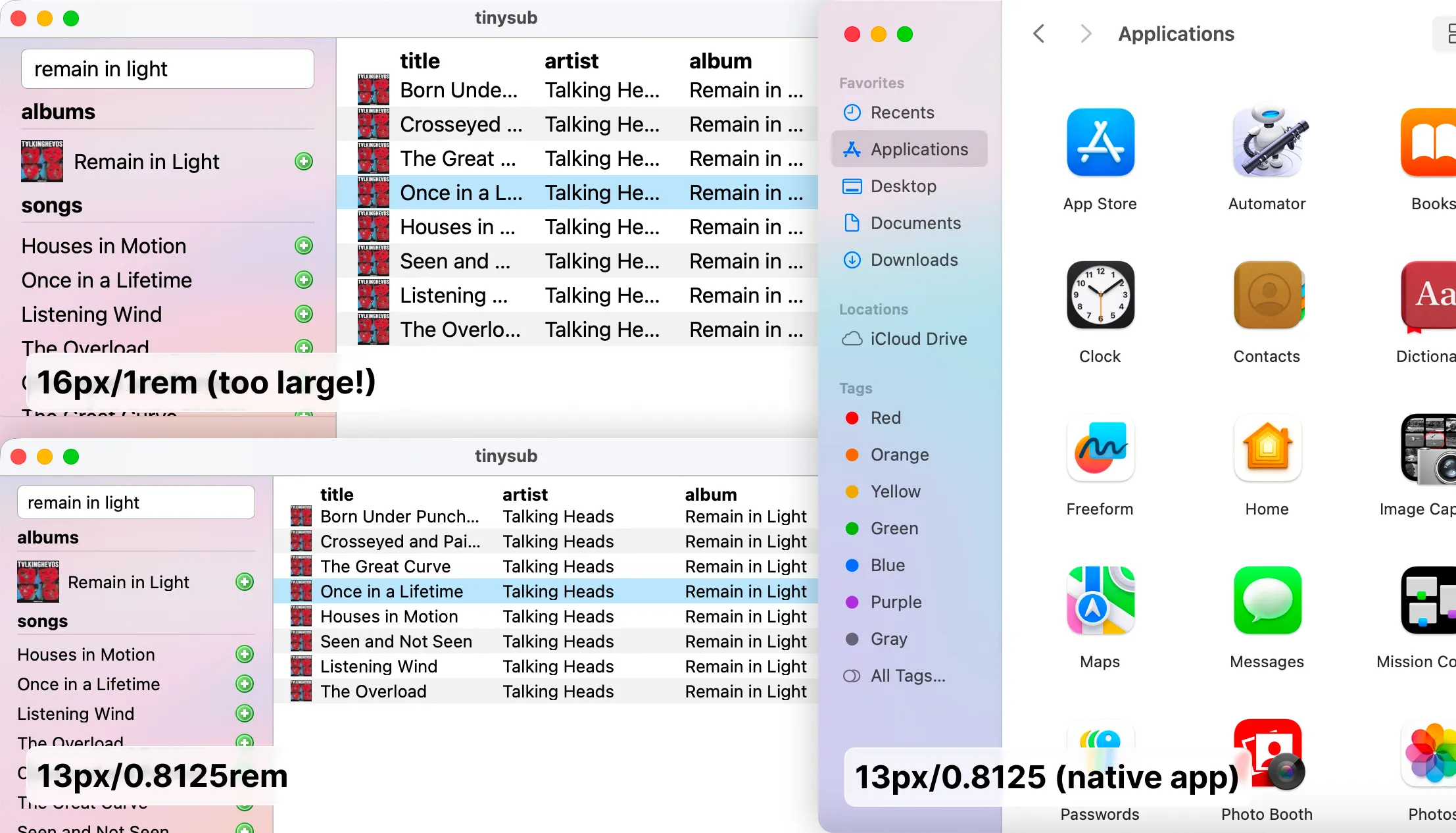
2. some CSS properties to change
In the HTML element, you should probably disable user-select (and -webkit-user-select for Safari) so that your user can’t select text, which stays consistent with native apps. You may want to re-enable this for body copy.
html { -webkit-user-select: none; user-select: none;}I recommend disabling overscroll so that you don’t get that “elastic scroll” effect on the main window, which is seen when scrolling on trackpads or mobile devices:
html { overscroll-behavior: none;}I recommend hiding the tap highlight on iOS devices, which usually causes a blue tint when you press a button:
html { -webkit-tap-highlight-color: transparent;}3. use proper viewport sizing
Mobile browsers dynamically shift and resize their search and action elements to make more space for the page. The typical vh and vw units do not dynamically change with those elements, often causing the viewport to exceed the browser view area. To mitigate this, use dvh and dvw, which do dynamically change. (for more details, check out this article by Anthony Frehner)
body { height: 100dvh; width: 100dvw;}4. adjust whitespace for safe-area
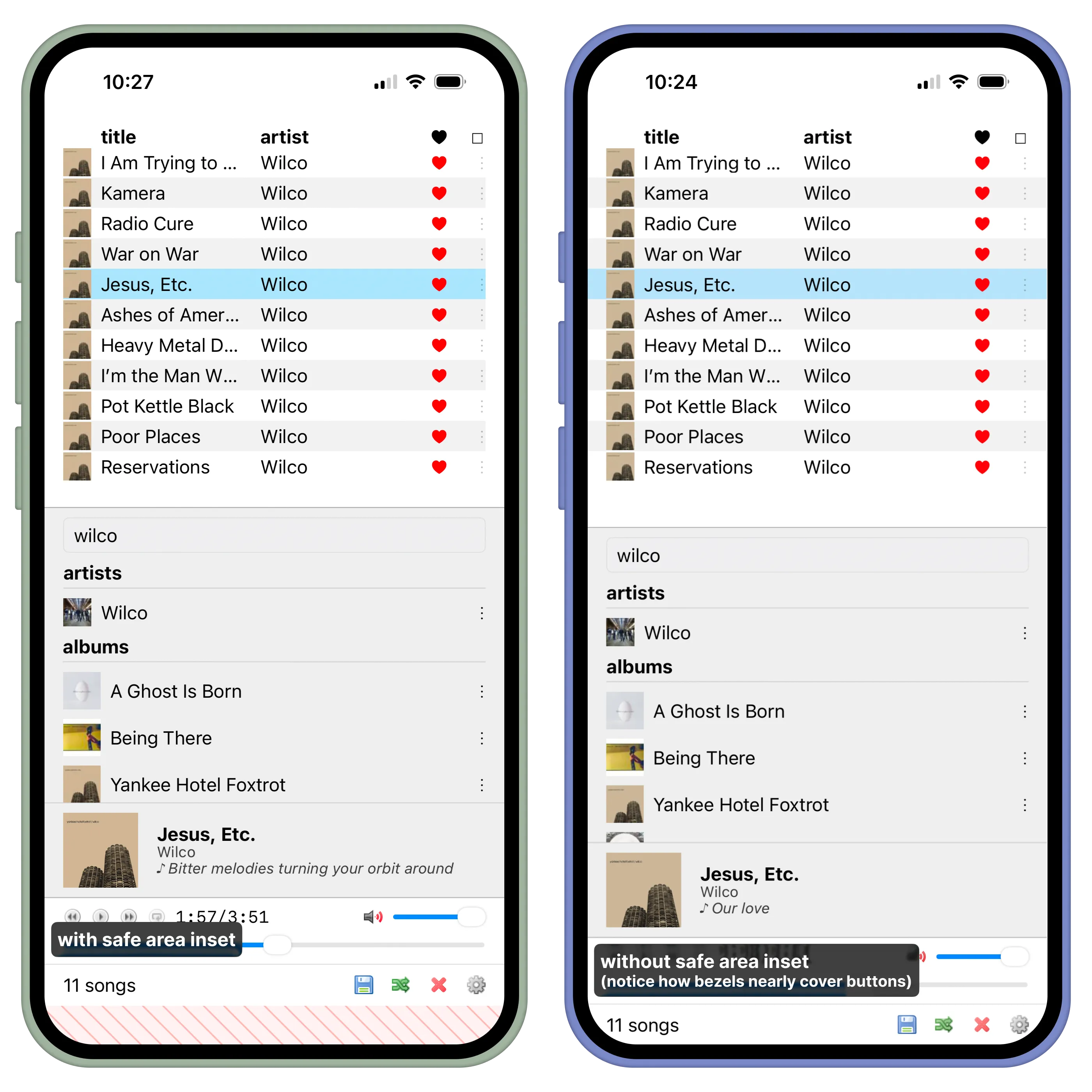
Another thing you should consider is adjusting whitespace for safe-area. For example, on an edge-to-edge phone where rounded corners are part of the screen, buttons in a footer/action bar could be impossible to reach if they are located behind those rounded corners, or otherwise uncomfortable to reach if they are too close to the bottom edge of the display.
Luckily, this is very easy to solve, thanks to the CSS env(safe-area-inset-*) variables which dynamically change based on the device you’re viewing on. In this case I went with borders instead of padding so that I could customize the color of the whitespace for each side, such as matching the bottom whitespace with the footer color of my app:
body { border-top: env(safe-area-inset-top) solid transparent; border-right: env(safe-area-inset-right) solid transparent; border-left: env(safe-area-inset-left) solid var(--bg-sidebar); border-bottom: env(safe-area-inset-bottom) solid var(--bg-footer);}On desktop these will typically have no effect but you will notice it on mobile devices:
5. use native context menus
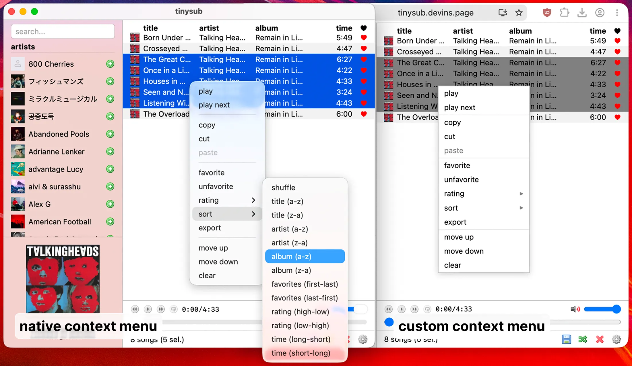
In Tauri/Electron apps, I recommend using native context menus, which tend to be more accessible, more consistent, and gives you less code to deal with than making your own custom context menu. In tinysub specifically, I use a custom context menu in the web builds, and native context menus in the Tauri builds.
Here’s the Tauri and Electron documentation to get started, and here’s what it can look like:
6. consider a custom titlebar
You may want to consider a custom titlebar. Doing so can allow the titlebar to flow better with your content, or allow you to save space by placing actions in the titlebar itself. Personally, I did not make a custom titlebar for tinysub as I felt it wasn’t necessary, and custom titlebars can often be a bit annoying on Linux.
Here’s the Tauri and Electron documentation to get started on custom titlebars.
7. only show window after page is loaded
I recommend disabling window visibility on startup, and then have your app code show the window only once the page is ready. This prevents any flashing or blank screens while your app is loading.
Here’s some snippets from my app:
let window = WebviewWindowBuilder::new((app, "main".to_string(), WebviewUrl::External(url))) .title("tinysub") .visible(false) // hide window initially, javascript code will unhide later //...other window propertiesexport const init = async () => { //...code to execute before showing the window if (isTauri) { const { getCurrentWindow } = await import("@tauri-apps/api/window"); const win = getCurrentWindow(); await win.show(); await win.setFocus(); } //...code to execute after window is done showing};8. window blur/vibrancy
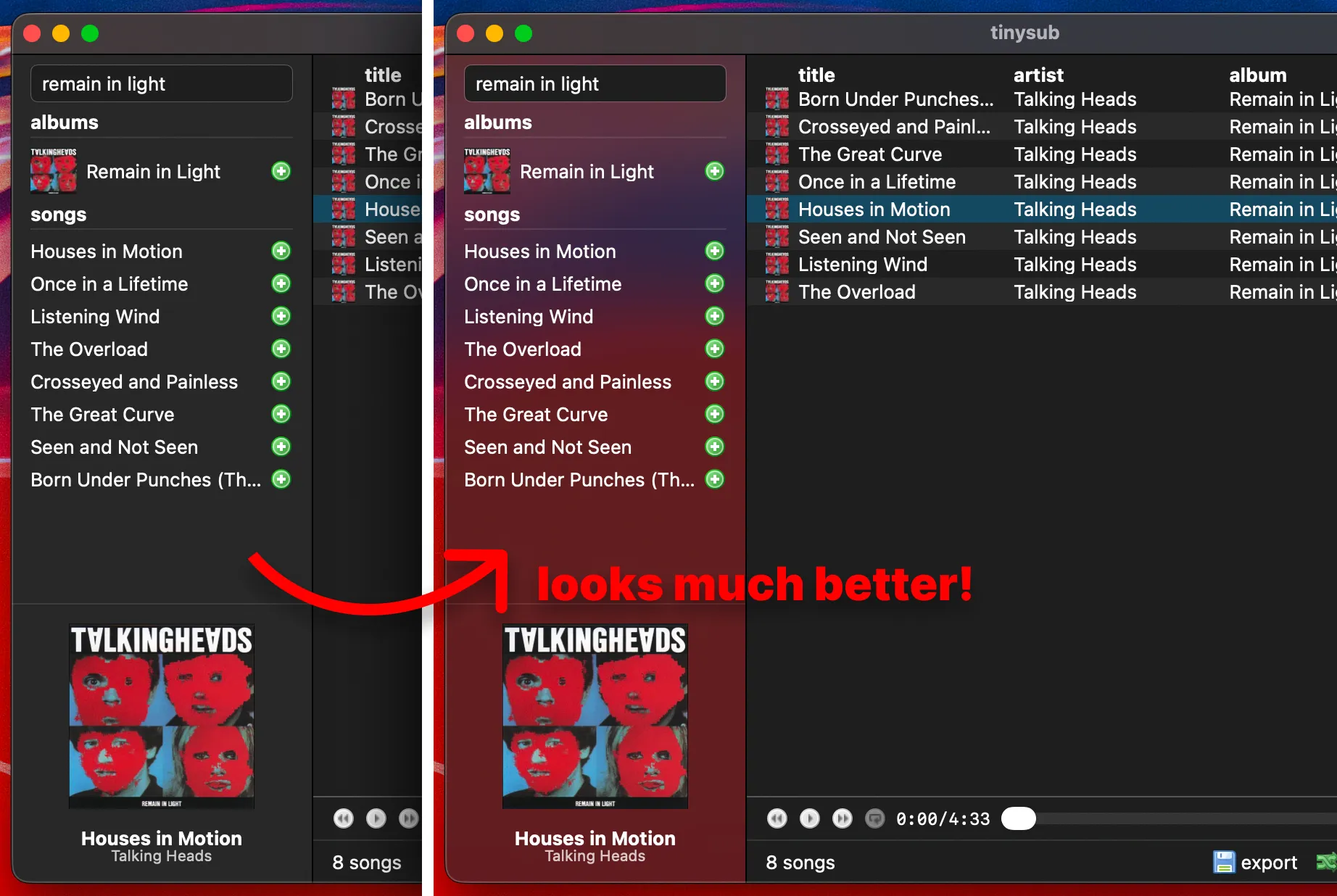
On MacOS and Windows, it’s relatively easy to achieve blur behind sidebars in Tauri with the window-vibrancy plugin. Vibrancy is possible on Linux desktops too, though on Linux, the compositor is what applies the effect, not the application itself, and only certain compositors support blur (i.e. kwin).
Here’s a snippet from my app, though I’d recommend reading the full documentation:
use window_vibrancy::*;
// macos vibrancy (using sidebar material)#[cfg(target_os = "macos")]apply_vibrancy(&window, NSVisualEffectMaterial::Sidebar, None, None)  .expect("unsupported platform! 'apply_vibrancy' is only supported on macOS");
// windows vibrancy (using mica material)#[cfg(target_os = "windows")]apply_mica(&window, None)  .expect("unsupported platform! 'apply_mica' is only supported on Windows 11");
You will need to enable transparency in the Tauri window builder. After that, make sure to set the body’s background-color to transparent so that you can actually see through the app, and then apply opaque colors to the main app section (in this case the song queue), leaving the sidebar transparent.
let window = WebviewWindowBuilder::new((app, "main".to_string(), WebviewUrl::External(url))) .title("tinysub") .transparent(true) // needed to see window-vibrancy effect //...other window propertiesbody { background: transparent;}
#queue { background: Canvas;}This effect can really help make your app feel more consistent with the rest of the system, though I’d recommend making transparency configurable for Linux users who don’t have a compositor that supports blur. And then that gives you this beautiful transparency effect:
9. styling tips
In tinysub I often used some OS-specific styling, such as a different color for the sidebar/titlebar borders to match native MacOS apps. I also used custom colors for item selection on MacOS. Tiny tweaks like these can make a big difference in how your app feels, even if the user doesn’t notice it.
In a lot of cases I actually just avoided hard-coded colors entirely unless where necessary. Instead I opted to utilize the CSS <system-color> type for various colors, and the color-scheme property for light/dark mode. It can be a lot simpler to write this way and also look more consistent with other applications, unless you have specific colors in mind for your brand.
10: other tricks
For even more tricks on making your app feel native, this article by Vadim Demedes is a great resource. I just wrote this article to add on some other ideas too.
ending notes
Apologies if this article is a little sloppy, these were just notes that I personally wrote for myself while developing tinysub. Hopefully it was useful to you or informational in any way. If you have any suggestions, let me know in the comments and I’ll edit the article accordingly.
Footnotes
-
When I am referring to “a native look on MacOS”, I am specifically referring to pre-Tahoe design. I don’t intend on implementing Liquid Glass elements into my app as it’s tricky to do in CSS, would be far too heavy, and I am personally not a fan of it regardless. However, the Cupertino theme for Obsidian does an excellent job on emulating the MacOS Tahoe design if you’d like to see an example of that. ↩
comments
wanna comment? reply on bluesky